So I have some time to kill this easter, all by my self — I needed a project and I decided that it was time to make my blog a little more mobile-friendly — As Jakob Nielsen puts it:
There’s no need to declare this “the year of mobile.” If anything, last year was the year of mobile in terms of the growth in both mobile usage and the availability of mobile sites and apps.
Obviously there is a good reason for wanting to be more mobile-friendly, but how do we do this? I started digging into the main rules or guidelines that one should keep in mind, and here is what I found.
Guidelines
You will, without a doubt, be able to find a lot more guidelines on how to act upon mobile devices. I´ve kept it simple and only pointed out the 3 main rules in my opinion.
1. Reduce content size
This point seems fairly obvious. Users on mobile devices are usually constrained by somekind of bandwidth-subscription and in any cases you can be pretty sure that their network speed is not quite as you would experience it on your laptop connected to your 100MBit network at the office. You would want to keep the overall size of the site as low as possible in order to give the mobile user as good an experience as possible (reduce loading time!).
2. Remove all the clutter
This point goes hand in hand with #1. Simplicity is the key — the less clutter and unnecessary crap (sidebars, banners, blogrolls, tweets etc.) you have on your site, the smaller the overall content size will be ⇒ the less the user will have to wait (and use his precious bandwidth).
3. Rethink your navigation
Navigation might play a bigger part than first imagined — Not only might you have to get rid of your sidebars and other fanzy-flashing content, you also need to rethink your main navigation-methods.
Even though most modern mobile devices support Java-scripting I wouldn’t use it for handling your main navigation (actually I would never use Javascript for handling links anywhere, if possible), but mostly I´m thinking of the scenarios where you would be using Javascript to display/do something based on a mouseover-/hover-effect — Touch-devices simply don´t support this (yet).
You might also wan´t to get rid of some of you navigations, eg. tag-clouds, blogrolls and even category-lists. Since I believe that you should stick to a single-column website (due to display sizes), placing all your navigations in the top, would push the main content way down the screen.
Implementation
Now that we have a few guidelines to go by — how and what do we actually need in order to carry out the changes? Well first of all we would only do anything different if we are sure that the user is actually using a mobile device.
1. Determine the user-agent
A way that we can determine if our visitor is using a mobile device or not, is to check the visitors user agent. A user agent is basically just a pease of information, that most programming languages can extract from a visiting client — For example an iPads user agent info would look like the following:
Mozilla/5.0 (iPad; U; CPU OS 3_2_1 like Mac OS X; en-us) AppleWebKit/531.21.10 (KHTML, like Gecko) Mobile/7B405
And an iPhone would look something like this:
Mozilla/5.0 (iPhone; U; CPU like Mac OS X; en) AppleWebKit/420+ (KHTML, like Gecko) Version/3.0 Mobile/1A543a Safari/419.3
Now based on the information in this “user agent string”, we could basically just do a search for the words “iPad” and “iPhone” to determine if the visitor was using such or not.
In PHP you´re able to fetch the user agent info, using the following super global $_SERVER[‘HTTP_USER_AGENT’].
Now there is a liiiitle more to it and way more devices than just the iPhone and iPad. If you´re like me, you would probably go ahead and find a library/class for handling this. I´ve found and used this “mobile detector class” which gives a pretty simple way on when to deliver my content to a mobile user and when to deliver to a desktop user.
$mobilDetector = new MobileDetect_Class();
if ($mobilDetector->isMobile() || $mobilDetector->isTablet()) {
    // Mobile stuff here
} else {
    // Desktop stuff here
}
2. Design
As stated in the guidelines we should remove size and clutter to reduce content size for a mobile user — now my “new” design is pretty simple as it is, but there is still a few improvements that can be made.
What I´ve come up with was to remove all sidebar-content and try to fit the content width to fit the mobile user (in my case I´ve only focused on the iPad and iPhone). How this is actually done, you can read below.
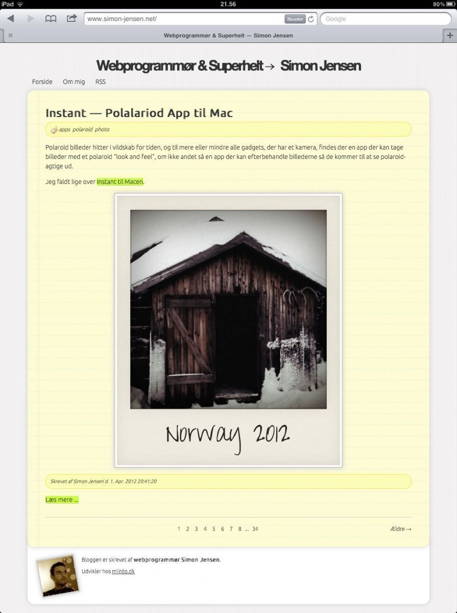
iPad results

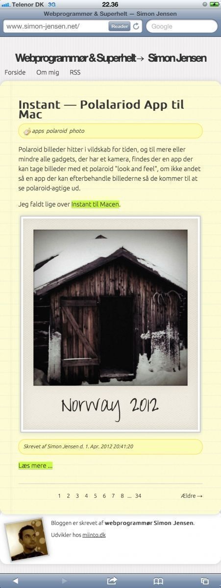
iPhone result

3. Viewport and media-queries
Now that we know that our visitor is using a mobile device and we have a more desirable design there are a few tricks to help us deliver this.
First, and sometimes this is actually enough, you would want to use the meta-tag called “viewport”.
The viewport-tag was originally developed by Apple, making it possible for developers to scale their content (viewport) to better fit the content on a page to the devices viewing it — You can find a detailed description, quite good actually, on Apple´s developer site.
In most cases all you need to do, is to add the following line to you pages -section.
<meta name="viewport" content="width=device-width; initial-scale=1.0; maximum-scale=1.0;" />
If the viewport-tag does not give you the desired result alone, you can start to tweak your design to better fit the mobile devices. In some cases it might be easiest to create a dedicated CSS document that you serve only to the mobile visitors, but then again, if only a few tweaks are needed you could use media-queries to overrule your desktop-rules with rules better suited for the mobile devices.
It´s actually pretty simple — here´s what I´ve done to change the content width to better fit the iPad:
#content {
    width: 820px;
    margin: 0 auto;
    padding: 30px 40px;
}
@media screen and (max-width: 768px) {
    #content {
        width: 688px;
    }
}
I actually only overrule the width, keeping the margin and padding settings — I´ve done the same thing for the iPhone just with a difference max-width. Other “queries” might come in handy, such as the orientation. Without having actually tried this, you should be able to “style” to the visitors orientation using the following queries:
@media screen and (orientation:portrait) {
    // Design for portrait mode
}
@media screen and (orientation:landscape) {
    // Design for landscape mode
}
Conclusion
So there you have it — in short what I´ve found and implemented to make my blog more mobile friendly was these simple X steps:
- Determine if visitor is using a mobile device (user-agent)
- Removed a few elements from the original design, when a mobile device is detected (I use twig as template-engine, so it was quite simple to create a new template for the mobile devices, and use this for rendering).
- Use CSS media-queries to easily overwrite CSS to better fit the design on mobile screens and orientations.
As a sidenote you might want to do a little more about you images than what I´ve done. I´ve simply added at max-width CSS-rule for images when viewed on a mobile device (cought by a media-query). This is absolutly not the best way to handle this, as you´ll put extra load on the mobile processors to rescale the images on the fly. You might want to look more into image generation/caching scripts, that can actually deliver images in a more preferable size.